Rekindling the joys of self-publishing

It started with watching my friends share their thoughts on the one popular blogdrive platform, which progressed on to me running a home-spun php blog with 4 asp scripts and an mdb file, which evolved into me setting up a multiuser site based upon MovableType and our “social network” formed from a blogroll widget running down the side of the blog.

From then on it was a bit of a blur. Multiply came and went, Facebook came and swallowed up a vast majority of the bulky blogs and comment boards set up where all people wanted to do was share photos and do whatever “friends” do. Twitter came from the other end and gave our 140 characters a home and a shot at RT infamy. As for Posterous, Tumblr, friendfeed, etc. I’d watch from afar and the hype has seemingly died down before I’d mustered up the courage to entrust my thoughts and relationships to yet another “free” platform.

My thoughts on what a website would be for me has been seriously muddied, particularly over the past year. I’d watch as publishing platforms evolved. Companies find new ways to provide services, own your data, define your relationships, gather clout and monetize, monetize, monetize. On the other hand, the pressure to write slickly-edited valuable, interesting, technical pieces (with pictures!) to present myself as a knowledgeable professional has produced exactly 2 try-hard articles and another 7 or so drafts that I either terrified to Publish or to even finish. I even attempted a “what I learned today” type blog as an SEO experiment and give adsense a shot. The result? Just over 500 hits a month and around $18 ad dollars after two years.

So this is my resolution. I’m giving up on trying to make anything happen, and will instead amaze myself again and again with the thought that a click of a button would send these words into the vast interwebs of unfathomable possibilities. I will I will write firstly for myself, and secondly for anyone else who is interested. There may be only two of you out there, but that’s two more than I could ever hope for.

Training & Inspiration

Every week, I get 3 hours with 60-70 students looking to equip themselves for the dark and evil world that is the creative industry. Before every class, I find myself having to choose between:

  1. inspiring these kids to create the uncreated and,
  2. training them in skills and tools to be able to do so

One might argue that both go hand in hand, equally and inseparably. I argue otherwise, stemming from an amalgamation of failed attempts, the awkwardness of the classroom setup and the sheer possibility that my competency as an educator is severely lacking.

My concession so far has been to give them the training and hope that when inspiration finds them, their tools will take them the distance.

How the heck can one claim to teach inspiration anyways?

Why the Natural Wireless Mouse didn’t do it for me

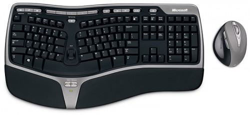
When I bought the Microsoft Ergonomic Desktop 7000, the reasoning was that my work involved substantial use of a keyboard, so it would be a good idea to invest in an ergonomic one – wireless would be nice too. One year in, I can safely say that they keyboard was a worthwhile investment; but this post isn’t about the keyboard – it’s about the mouse that came with it.

The Natural Wireless Laser Mouse came as part of the Desktop bundle. Being a sucker for trying out new things, I gave myself a period of time to “break in” to the slightly foreign posture that your arm assumes when using one such mouse.

These pictures doesn’t really do justice to how weird it feels using such a contraption. If you can imagine gripping an upright soda can tightly and sliding it around on the table, that’s how it feels like.

The upright-ier posture did take the strain off my wrist as advertised. Rather than twisting my palm downwards to reach for a flat mouse – the mouse came to me.

After many months of attempting to get used to the mouse though, I still found it frustrating/slow to use but couldn’t understand why – until now.

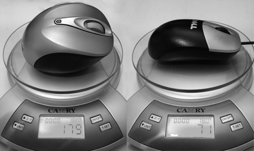
Firstly, this mouse is heavy. The wireless mouse weighs in at more than twice that of a standard issue Dell mouse (179g vs 71g), making it very tiring to push around all day. The heft comes mainly from the twin double-A batteries that power it.

Secondly, the ergonomic posture of the mouse actually immobilizes your wrist and forces you to operate it by moving your arms. You may not have notice this before, but chances are, you actually flick your mouse around using your fingers and wrist rather than your arm. This gives you more control when you’re performing fine movements like editing graphics or selecting a phrase of letters.

Finally, because of its “natural” organic shape, it’s hard to tell which way is “up”. The very first Apple USB Mouse suffered from a similar problem.

After a year, I given up learning to use this and swapped back to the unergonomic standard-issue Dell mouse. The keyboard is great though.

Nicely done AFR

Today I spotted a rather nicely executed piece of typography. This is probably done many times over in news prints everyday, but this one caught my eye over breakfast and I thought it worth highlighting and celebrating.

image

Here we have a photo of the front page of the Australian Financial Review. Running down the left side of the page is a list of headlines. Two things to notice here.

  1. The headlines alternate between black and red making it easy to scan through the headlines.
  2. The names of the journalists as well as the page number for the related article remain in black.

Now consider the options for presenting such a listing.

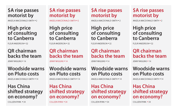
  • Column 1 has everything in black. You get a wall of black text rather than 5 distinct headlines.
  • Column 2 alternates the whole chunk in black and red. While this distinguishes the headlines most effectively, the readability of the author/page number subtext for the red headlines are compromised.
  • Column 3 tries to maintain readability of the author/page number subtext, but now we’re not sure who wrote which piece. Is “QR chairman backs the team” by Fleur Anderson or Jenny Wiggins?
  • Column 4 (which is what the paper opted for) is genius. Let’s take a closer look.

Can you spot it yet? What the typographer at the AFR did was keep the alternating red/black, spell out the author/page number subtext in black readability goodness, but used the dot between author name and the page number to subtly hint to the reader that “QR chairman backs the team” was indeed written by one Jenny Wiggins and you can find the piece on page 14.

For many readers, this would have been the difference between a split-second double-take and being propelled to page 14 by a subliminal confidence afforded by a scarlet dot.

Anatomy of applause control

image

Make an announcement “Our graduates will be coming up in groups of 10 or less. So that we can hear all our graduates’ names called clearly, please save your applause for the end of each group.”

First few graduates take the stage. Isolated applause emerge from family/friends of graduate, followed by a feeling of embarrassment for disobeying the announcement. Being caught out as the cheering minority in the group also reinforces “it is not time to clap yet”.

First group completed, people on the stage clap – cueing the crowd to cheer along. Conditioning is complete. The crowd knows when to clap, and when not to.

Inevitable, a rogue group would cheer and clap loudly. The crowd snickers and scoffs at their irreverence. Immediately after one such an event, the friends of the next graduate attempts a similar feat but quickly backs off in shame.

Crowd feels sorry for them and vows never to find themselves in such a position.

Problem solved.