The irk of supposed innovation

The topic of innovation is one that gets a lot of air time within the social circles that I’ve found myself in.

Allow me to begin with two lists on the matter.

To start us off, a list of words/phrases that often get associated with it – “sexy”, “cool”, “visionary”, “never been done before”, “creative”, “overnight success” and “crazy”. The list goes a lot longer and grows far more absurd that I am comfortable describing. But you should be able to extrapolate on that trajectory with minimal effort.

The next is a list of actions that almost certainly disqualifies you of the innovation badge – “learning from what others have done”, “reusing components”, “focus”, “watching the bottom line”, “defining the problem thoroughly”, and adopting any sort of formal, structured, even remotely rigid “engineering” approach to coming up with a solution. Again, far from comprehensive, but sufficient to launch you in the right direction.

What gets me about these lists is how it is treated as a checklist for what innovation looks like. Failing to check off any of this items earns one a spot in the “not innovating enough” bucket. Very rigid – considering we’re gunning for innovation.

Try tell it to the guys who have been at it for 8 years before coming up with Angry Birds. Tell that to the Japanese engineers whose rigid building codes saved thousands if not millions of lives. The fact of the matter is that the bits that gets celebrated, wow-ed at, and gets to strut up the spot-lit stage to receive the prize is merely the tip of the innovation iceberg. The majority of it actually lies beneath the the icy cold waters – execution, iteration, engineering day after day.

Maybe I am just tired of firstly trying to live up to a certain narrow-minded brand of innovation, and secondly having the mundane, routine, structured predictabilities dissed just because we’re a privileged, spoiled, attention deficient generation who have very little affinity towards hard work and very little regard for the legacy that the generations past have afforded us.

If that is innovation, that I want no part in it.

And yes, I am having a bit of a vent.

Why the Natural Wireless Mouse didn’t do it for me

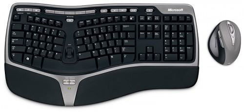
When I bought the Microsoft Ergonomic Desktop 7000, the reasoning was that my work involved substantial use of a keyboard, so it would be a good idea to invest in an ergonomic one – wireless would be nice too. One year in, I can safely say that they keyboard was a worthwhile investment; but this post isn’t about the keyboard – it’s about the mouse that came with it.

The Natural Wireless Laser Mouse came as part of the Desktop bundle. Being a sucker for trying out new things, I gave myself a period of time to “break in” to the slightly foreign posture that your arm assumes when using one such mouse.

These pictures doesn’t really do justice to how weird it feels using such a contraption. If you can imagine gripping an upright soda can tightly and sliding it around on the table, that’s how it feels like.

The upright-ier posture did take the strain off my wrist as advertised. Rather than twisting my palm downwards to reach for a flat mouse – the mouse came to me.

After many months of attempting to get used to the mouse though, I still found it frustrating/slow to use but couldn’t understand why – until now.

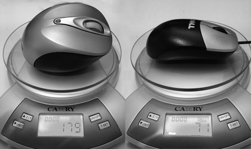
Firstly, this mouse is heavy. The wireless mouse weighs in at more than twice that of a standard issue Dell mouse (179g vs 71g), making it very tiring to push around all day. The heft comes mainly from the twin double-A batteries that power it.

Secondly, the ergonomic posture of the mouse actually immobilizes your wrist and forces you to operate it by moving your arms. You may not have notice this before, but chances are, you actually flick your mouse around using your fingers and wrist rather than your arm. This gives you more control when you’re performing fine movements like editing graphics or selecting a phrase of letters.

Finally, because of its “natural” organic shape, it’s hard to tell which way is “up”. The very first Apple USB Mouse suffered from a similar problem.

After a year, I given up learning to use this and swapped back to the unergonomic standard-issue Dell mouse. The keyboard is great though.

Nicely done AFR

Today I spotted a rather nicely executed piece of typography. This is probably done many times over in news prints everyday, but this one caught my eye over breakfast and I thought it worth highlighting and celebrating.

image

Here we have a photo of the front page of the Australian Financial Review. Running down the left side of the page is a list of headlines. Two things to notice here.

  1. The headlines alternate between black and red making it easy to scan through the headlines.
  2. The names of the journalists as well as the page number for the related article remain in black.

Now consider the options for presenting such a listing.

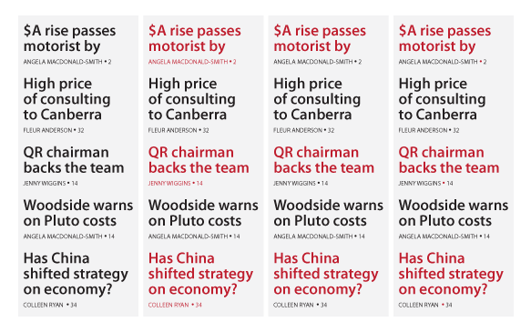
  • Column 1 has everything in black. You get a wall of black text rather than 5 distinct headlines.
  • Column 2 alternates the whole chunk in black and red. While this distinguishes the headlines most effectively, the readability of the author/page number subtext for the red headlines are compromised.
  • Column 3 tries to maintain readability of the author/page number subtext, but now we’re not sure who wrote which piece. Is “QR chairman backs the team” by Fleur Anderson or Jenny Wiggins?
  • Column 4 (which is what the paper opted for) is genius. Let’s take a closer look.

Can you spot it yet? What the typographer at the AFR did was keep the alternating red/black, spell out the author/page number subtext in black readability goodness, but used the dot between author name and the page number to subtly hint to the reader that “QR chairman backs the team” was indeed written by one Jenny Wiggins and you can find the piece on page 14.

For many readers, this would have been the difference between a split-second double-take and being propelled to page 14 by a subliminal confidence afforded by a scarlet dot.

Anatomy of applause control

image

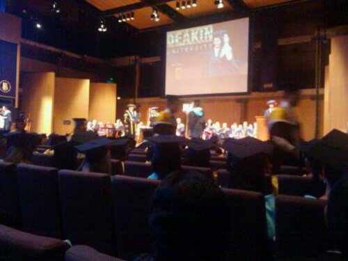
Make an announcement “Our graduates will be coming up in groups of 10 or less. So that we can hear all our graduates’ names called clearly, please save your applause for the end of each group.”

First few graduates take the stage. Isolated applause emerge from family/friends of graduate, followed by a feeling of embarrassment for disobeying the announcement. Being caught out as the cheering minority in the group also reinforces “it is not time to clap yet”.

First group completed, people on the stage clap – cueing the crowd to cheer along. Conditioning is complete. The crowd knows when to clap, and when not to.

Inevitable, a rogue group would cheer and clap loudly. The crowd snickers and scoffs at their irreverence. Immediately after one such an event, the friends of the next graduate attempts a similar feat but quickly backs off in shame.

Crowd feels sorry for them and vows never to find themselves in such a position.

Problem solved.